The problem
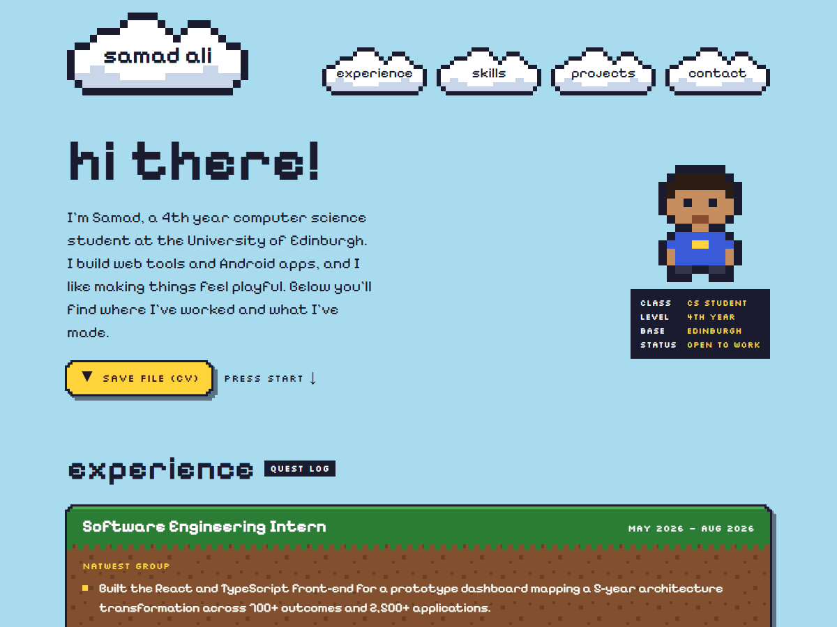
A portfolio should show how I work as well as what I've made, and be fun to look around. This site is a retro pixel-art world you scroll through, built like a real product: planned in phases, shipped in small pull requests and tested at every step.
My approach
- Small, reviewable steps. Each phase of the roadmap has its own branch and pull request, made of small Conventional Commits.
- Next.js and Tailwind CSS. The site uses the App Router with strict TypeScript. The palette, pixel sizes and animations are Tailwind theme tokens, and stepped pixel corners are a custom utility.
- Sprites as code. Every sprite is a grid of letters, one per colour, typed so an unknown colour is a compile error. Each one renders as a crisp SVG, with neighbouring pixels merged into single rectangles.
- Content that can't break the site. Experience, projects and skills are data files validated with Zod. A typo, a missing field or a console colour too light for white text fails CI instead of reaching the live site.
- Tested on every pull request. GitHub Actions runs lint, type checks, formatting, unit tests and a build. Playwright then runs against each Vercel preview.
- Accessible by default. WCAG AA contrast, a skip link, focus outlines that survive the clipped corners, and no animation for people who prefer reduced motion.
The code is on GitHub (opens in a new tab).
What I learned
- Clipping elements into pixel shapes also clips their borders and focus outlines, so outlines are drawn with filters on a wrapper and focus rings sit inside the shape.
- Hosting can change behaviour that works locally: Vercel's download headers override the link's
downloadname, which only an end-to-end test against the real preview caught. - Screenshots catch what tests don't. Looking at every change at phone and desktop width found a font ligature that turned "fi" into an "A".